This Friday marked the end of our Web Fundamentals course. Known as “Composite Week”, we were given the assignment of creating a five page website that had to adhere to certain rules.
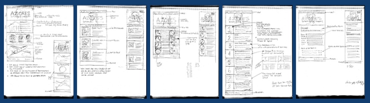
- The Initial designed site had to begin with sketches leading to wireframes and finally to finished mockups. mock-ups
- Set up a proper folder structure for the site (root folder, images folder, CSS folder, and JS folder)
- Write the HTML for your first page and make sure to have it validate through the W3C
- Make sure all images used were optimized for the web
- Style the CSS for the website
- test in as many browsers as possible and fix any errors.
- Duplicate the original page to use as the template for the other four pages
- Insert the content into the other web pages and ensure that they all validate as well
- Test the new pages and make sure that they all validate through the W3C validator
- Put our finished website online and make sure that it validates.
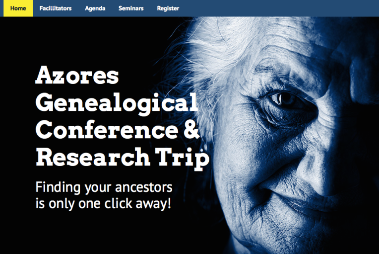
I decided to create a website for the Azores Genealogical Conference that occurs annually in Salt Lake City, Utah. I received the content from Cheri Mello and was able to start on some rough sketched ideas.
I thought the imagery should centre around a likeable grandmotherly type, after all, if someone is researching and trying to find out about their history, wouldn’t you want to discover that your great grandparents were kind and cute ancestors? Looking around for the photo could have been a daunting task, going through various websites and trying to find a free photo that could be used for this purpose could take a while and we really only had about 3.5 days to finish this project. I decided to purchase the photo through Bigstock photos. Also, I could probably use a photo of a plane as well to indicate that travel for the conference might be available through specific airlines that fly to Salt Lake City.
The next step in the design process was to create wireframes for the project. Generally when designing wireframes, you should create a wireframe for each different sized web page as well as any pages that differ enough to require something that a client can see in order to get an idea about what you are trying to convey.
So, in this particular project we were asked to create a graceful degrading website that would scale from desktop to mobile. After the sketches, i began to create my wireframes using a 960 pixel grid for the 5 different desktop pages in my website. They were different enough that i felt it really should be done and presenting to the client, i’m sure that it was appreciated.
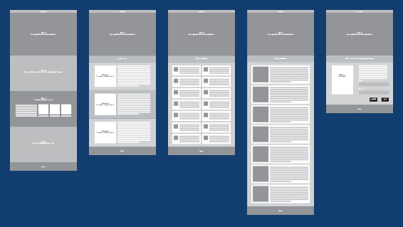
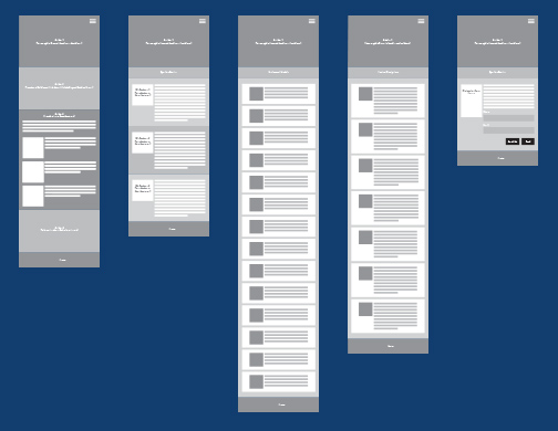
The next step was to create the same wireframes for mobile devices. In the actual coding of my site, i would have to tailor them a bit more using responsive design with media queries and adding a viewport meta tag into the head section of my html files.
The next step in the process of designing the website was to move to mockups of the wireframes. This process involves adding images, colour and other content onto the design and making it look as close to a finished project as possible. The wireframe process is used to give a general idea life, to show the client and receive feedback on the general positioning of element on specific pages and to see if the design aligning with their thoughts. The mockup is further down the road when you have received the ok to proceed and you are now ready to present to the client before beginning the actual coding of the project. At this point, you want to present the pages to the client in as close a resemblance to how we imagine the website to look as possible. The text for the site should be in place as well as the assets created for the project before presenting to the client and getting their feedback or ok in order to proceed.
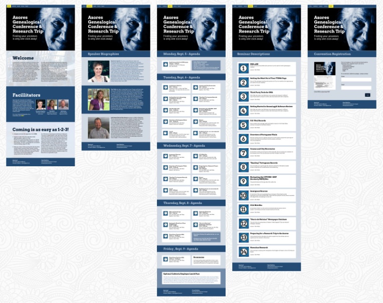
I had to create some assets for the website in order to distinguish the seminars as well as to make the agenda page which was a bit dry and needed a bit of colour as well as something that made the event times a bit more interesting. I created some icons for both pages in Adobe Illustrator and was able to incorporate those into the Agenda and Seminar pages.
The last portion of the project was probably the most critical; coding was going to take a while. After using the 960 grid, it was a bit easier to figure out margins and padding for specific elements on the page and that certainly helped. However, moving into responsive design mode provided its own set of issues. Elements began to creep in that I had not thought would not pose a problem. the grandmotherly image in the header didn’t work well when scaling down and things elements shift and have to be reconfigured for smaller devices. Something that designers learn with time.
Overall the project was a challenge that I hope I was able to live up to. The webpage is online here, and although not entirely complete, I think for 3 days, the presenters of the Genealogical Conference of Salt Lake City will be very pleased.
—Mark, you can download the files for marking here.


 PORT-BOY DEV's WEB DESIGN BLOG